Each part of the writing process creates its own obstacle. Creating a cover image is definitely no exception. Not only must its image capture the attention of a would-be reader, but it must also tell something of the story within it. If you’re really successful, you’ll even have pieces visible to the reader only after reading the story. They finish the last page, hold the book or e-reader in their hands and think “Ah, that’s what the picture meant.” If you’re writing a series, such as Chambers of the Heart, this is even a tad more difficult as your covers must flow. Thankfully I’ve been able to work with a wonderful designer who helps me mold my story into an image.
If you’ve not yet read When It Raynes, please do not continue reading any further.
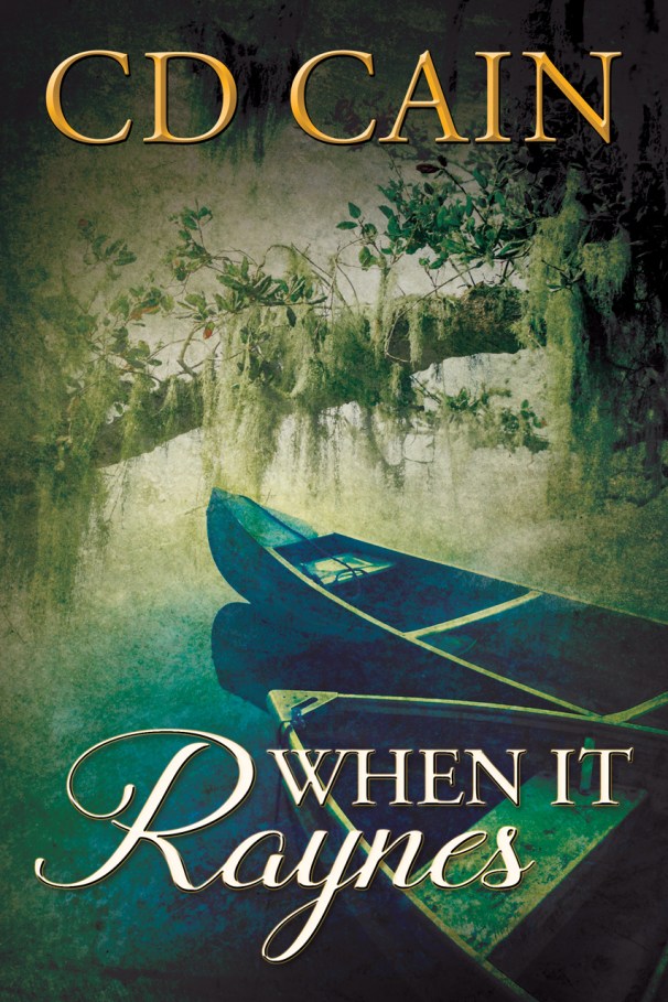
The cover for “When It Raynes” depicted a scene of Rayne’s life. Two canoes floated gently along a bayou. Its water was calm without ripple or wave. Their hulls were protected by a canopy of trees above. This was the essence of Rayne and her life. For those who purchased the print edition, there was foreshadowing on the back cover as one single canoe floated atop the water. In this book, Rayne is left to navigate alone after the vivacious Sam comes into her life to create anything but smooth waters. Her once certain path was left in disarray and her canopy of protection was gone.
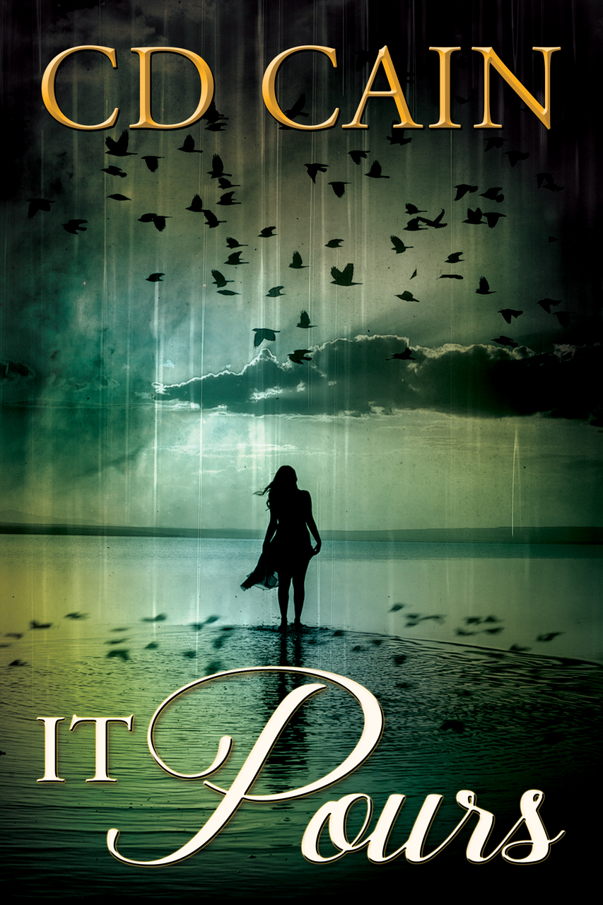
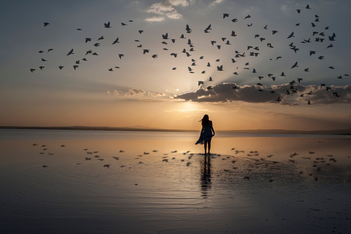
In “It Pours”, we see a silhouette of a woman walking along the shore. She’s alone in the setting sun. The footsteps of where she has been have been washed away from the waves as they roll upon the shore. Above her is a flock of seagulls flying overhead. Their shadows surround her steps. In this book, Rayne has to find who she truly is among the shadows of who she was. It’s her time to stand alone in her own waters. The sun sets on a life she knew with hopes of rising on a life where she is free to fly in her own direction. If she can heal the heartbreak left by Sam’s leaving, she may find her life to be filled with new friends and loves. But as with any tide, the rising waters will leave Rayne to face the pending confrontations from Grant and Charlie Grace.

I just love the cover of When It Rains and was drawn to the book because of the cover. In fact I am always very much drawn to buy books/ebooks based on the cover. The covers for both When It Rains and It Pours are so beautiful, possibly the best covers I have seen for quite sometime. I can’ wait for It Pours and the third book of the Chamber of the Heart series After the Storm to be finished, released and available in Australia. Best wishes as you complete these books.
LikeLike
Hi Sandra,
Thank you so much for commenting. A good cover is a huge attention grabber for me as well. I like when the cover matches the story. I want it to give a pretty good hint as to the “setting” or story I will find in the pages beneath it. I truly wrestled with putting a silhouette of a woman on the cover of It Pours; so, I’m very happy you liked it. The setting and location were such a huge character in the first book that the cover fit. In It Pours, it’s Rayne’s journey to finding herself. I thought this cover fit it really well! Again thank you so much for reaching out. I do hope you continue to enjoy the series.
Cd
LikeLike
Is it pours going to be released in March?
LikeLike
I’ve submitted the final revision to my editor and proof readers. I hope to release it by the end of the month. I really hope you’ll enjoy it!
LikeLike